5 Converting Payment Page Examples + Bonus: How to Build a Profitable Checkout
The design of the payment page plays an important role in building a business and brand recognition in general. If the customer experiences difficulties in the process of purchasing and registering the goods, there is a high probability of failure at the final stages of the transaction.
For what reasons can a buyer abandon a cart?
- The checkout page does not inspire confidence in data protection.
- A low number of payment options.
- Poor page usability.
- Confusing checkout process.
- Technical crashes while filling in purchase data.
- The presence of an unexpected margin.
Even if your credit card processor has all the necessary functions, it is still not enough. If the checkout page is framed poorly, customers will leave without buying anything.
Most companies do not bother with the design of the checkout page, limiting themselves to the attractive design of the home page, missing this critical point. However, the average checkout abandonment rate is 63,23%, according to Conversion Optimization Company Invesp
Today we will analyze examples of the most high-quality designed payment pages.
It’s Watch
Almost everyone who purchases goods online wants to be sure of the money transfers security. At first glance, it may seem that there are too many inputs, but in this way, the payment page will receive only reliable information For Its Watch, data security is a priority. Like many others, this company uses a white background. It is most neutral and does not cause a desire to interrupt the purchase.
Jacquemus

The fashionable design of the Jacquemus website ensures that the client will enjoy their time and will not leave the site until they make a purchase. The payment page is focused on elegance and simplicity. Also, the client has the opportunity to track the purchase at any stage, thanks to a special indicator. Besides, on the site, there is contact information for communication with tech support.
Nixon
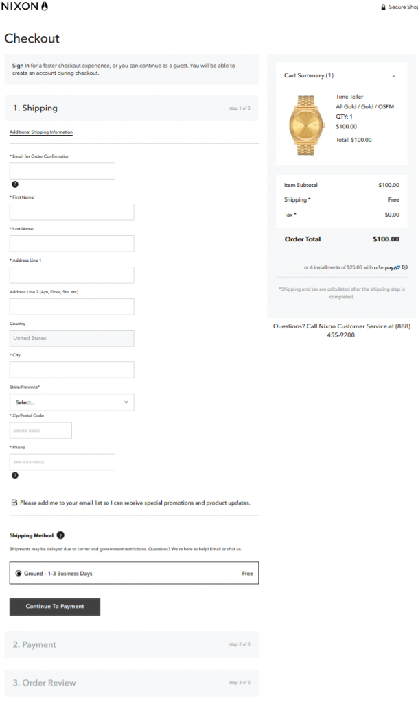
Due to the presence of many inputs, customers may be bored with filling them all out, so Nixon uses a navigation chain to show the progress of the purchase. It allows you to control the process and make adjustments with ease.
eBags
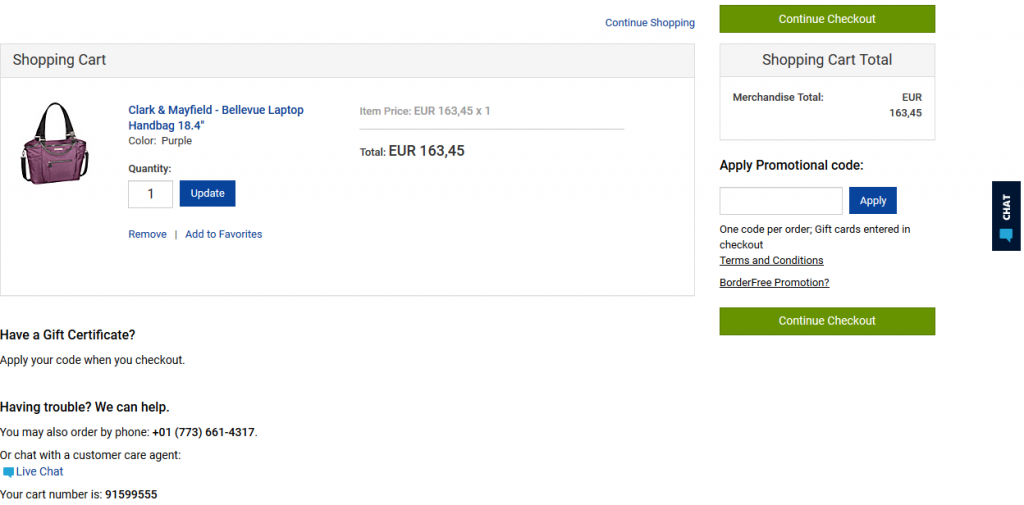
The simple and elegant design makes the payment page stylish and attractive. The client has a clear idea of what to do and what fields to fill out. Also, the site additionally indicates what information is needed. For maximum comfort, the site has a chat with an online consultation where you can get an answer to the question about goods and payment. For each product purchased, the client receives points that can be spent on the next purchase.
Glossier
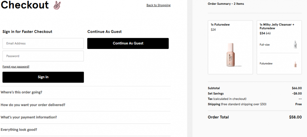
The brand image is reflected in the elegant design of the payment page design. On the right, the customer has the opportunity to preview all the goods and the total cost. The color scheme has nothing superfluous, excluding the possible distractions of the client. Customers can make purchases as guests or log in if they have an account.
Also on the site, there is the possibility of receiving a gift card.
How to build a quality checkout?
To decrease the cart abandonment rate, consider the basket of the online store as a conversion page. You will be surprised by the amount of potentially converting features this page holds and the risks which even the minor flaws on it present.
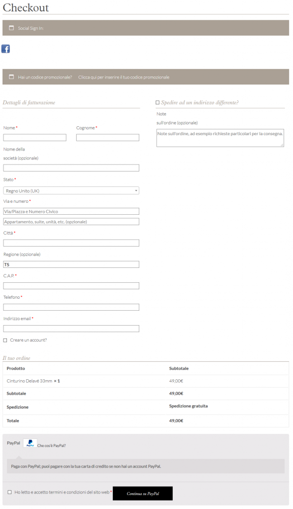
Primary elements of checkout:
- Product Name.
By the name of the goods in the checkout, the customer should clearly understand what exactly he ordered in the online store. A proper name contains all the necessary information. So a person does not have to go over again to reconcile to the product card.
- Product Image.
It is another way of identifying a product. By name, it’s not always clear what exactly is in the checkout, and the relevant image will help determine the product faster.
- Price, quantity, and total cost.
These three elements must be required.
- Delete button.
The last required item for the checkout. Using this button, a person can quickly correct the contents of the checkout. A prerequisite is that the button is located opposite each heading and is noticeable.
Additional checkout elements:
- Navigation chain
The navigation chain clearly shows what steps the user has to go through to complete the purchase. Also, he can always return to the previous stage by clicking on the link in the chain.
- Possibility to return a deleted item
It occasionally occurs when a person clicks on the delete button. Or removes, but then changes his mind and still decides to buy the good. In these cases, it is convenient when the product is not permanently deleted from the checkout, and there is a ‘restore’ button.
- Payment and Shipping Information
Frequently, when purchasing a customer’s product, they are interested in the possibility of a refund if they are not satisfied with the purchase.
- The choice of size, color, modification
Many products have various modifications, such as size, color, content. The price of the goods directly depends on this. Therefore the client must have the opportunity to clarify the equipment.
- Additional services
It is a variation of cross-selling, in which the merchant may offer to purchase other services, such as maintenance.
Remember that customers are always right and do not ignore their complaints and suggestions. Perhaps what seems understandable and straightforward to you causes other people difficulties. Considering the needs of users, and setting up the basket of your online store’s website correctly, you will add customers to yourself, making the purchase process even more comfortable for them.